


Introduction
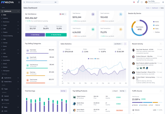
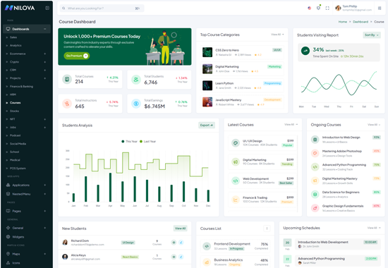
Nilova – NextJs App-Router Typescript React Bootstrap Premium Admin & Dashboard Template for All Your Web Projects
Nilova – NextJs App-Router Typescript React Bootstrap Premium Admin &
Dashboard Template that combines modern and minimal design with full flexibility
and responsiveness. It’s crafted using NextJs , CSS3 ,
and React-Bootstrap offering seamless customization with SASS
integration. Whether you’re building a web application, admin dashboard, or
project management platform, this template ensures your site stands out with
ease.
Support and Updates:
When you purchase Nilova, you gain access to free future updates to ensure your template remains up-to-date. Plus, our support team is always ready to assist with any questions.
Dependencies for Nilova
What Do You Get with the Nilova:
Nilova provides all necessary NextJs, CSS, SCSS, Tsx files, along with detailed Documentation to help you easily customize and implement the template.
Nilova Compatibility with Popular Browsers:
Nilova is fully compatible with major browsers, ensuring a seamless user experience across Chrome, Firefox, Safari, Edge, and Opera.
Getting Start Guide
Setting Up The Local Environment & Workspace
This comprehensive guide provides step-by-step instructions on how to set up your development environment Nextjs tool. It covers everything from the necessary prerequisites to installing the tool, creating an initial workspace, and setting up a starter app. You'll also learn how to run the app locally to test and verify your setup. By following this guide, you can ensure that your development environment is properly configured for Nextjs, and you can get started with your project confidently and efficiently. Whether you're a beginner or an experienced developer, this guide is an essential resource for anyone looking to work with Nextjs.
Nilova - File Generate
Creating a Component
The easiest way to create a component is with the React CLI. You can also create a component manually.
Creating a component using the React CLI
To create a component using the React CLI:
- From a terminal window, navigate to the directory containing your application
- Run the
generate-react-cli component <component-name>command, where<component-name>is the name of your new component.
code
generate-react-cli component <component-name>- A folder named after the component
- A component file,
<component-name>.component - A template file,
<component-name>.component.tsx - A CSS file,
<component-name>.component.css - A testing specification file,
<component-name>.component.spec.ts
<component-name> is the name of your component.
Installation Process
How to Run the Nilova Template:
Step 1:
Download the project, extract it, and navigate to the final template folder namedNilova-Nextjs App Router TS Final. Open the template to
proceed.
Step 2:
Open your terminal or command prompt and run the following command to install the packages:code
npm installcode
yarn installStep 3:
After the installation, run the project using the following command:code
npm run dev
code
yarn run dev
Once you serve your application by default it will take their default port using http://localhost:3000/
How to Convert SCSS to CSS:
If you need to change any styles, modify the SCSS files. To convert SCSS to CSS, run the following command:code
npm run sassNote:
If your are using "npm install", You should need to delete the "yarn-lock file" from project root.
If your are using "yarn install", You should need to delete the "package-lock.json file" from project root.
To install the peer Depencies
In general, the npm i command is used to install all dependencies or devDependencies from a package. However, sometimes you may encounter errors while installing certain dependencies. In such cases, the --force argument can be used to force npm to install those dependencies.
Using the --force argument can be helpful when you need to install a specific dependency that is causing issues during installation. However, it should be used with caution, as it can potentially cause conflicts with other dependencies or lead to unexpected behavior. It's always a good idea to thoroughly test your application after using the --force argument to ensure that everything is working as expected.
code
npm install --forceSkipping the installation of peer dependencies can sometimes lead to issues with the functionality or compatibility of the package. To ensure that your package functions correctly, it's important to manually install any missing peer dependencies using the npm install command. When installing peer dependencies, you should also be aware of the potential for conflicts with other packages or dependencies. It's a good idea to carefully review the peer dependencies required by each package and ensure that they are compatible with other packages in your project. By taking these steps, you can avoid potential issues and ensure that your packages are installed and functioning correctly.
code
npm install--legacy-peer-depsWe have to use only one file example: (for yarn yarn-lock) & (for npm package-lock.json) file
For Build your Template
Build your application for host on server using below command:
code
npm run build
code
yarn run build
"Similarly, the starter kit can be installed as well."
Installation Video
Folder Structure
StaterKit Guide
Purpose of a starter kit
Introduction to the NextJS Typescript Starter Kit Template:
The NextJS template starterkit is a resource that helps developers kickstart their NextJS web development projects by providing a preconfigured and ready-to-use template. It aims to simplify the initial setup and provide a foundation for building NextJS-based websites or applications.
Purpose of the NextJS Starter Kit Template:
The purpose of the NextJS Starter Kit Template is to save developers time and effort by offering a set of prebuilt files and configurations commonly used in NextJS projects. Instead of starting from scratch, developers can leverage the starter kit to quickly set up a project structure that adheres to best practices and industry standards.
Benefits of Using the NextJS Starter Kit Template:
The starter kit eliminates the need to set up the basic project
structure manually. It provides a well-organized file and folder
structure, including commonly used directories for separating code,
templates, assets, and configuration files. This allows developers to
focus more on implementing business logic rather than spending time on
initial setup.
Before using the NextJS Starter Kit Template, developers should have a
basic understanding of NextJS and web development concepts.
Starterkit Overview
You can use the Starterkit if you are creating a new project. It will be time-consuming to use the full admin version for a new project as Nilova-nextJs Typescript have more than 150 components.
We have provided all the pre-build layouts like Sidemenu, Header, footer and blank pages etc in the Starterkit.
For further information or support regarding the template, please contact us using the provided link.
https://support.spruko.com/Starterkit Folder Structure
- Take a quick look at the folder structure of the "Starterkit."
- Integration of your customized NextJS pages becomes easy when using the "Starterkit."
- The "Starterkit" provides all the layout components, related assets, and plugins.
- To explore the contents of the "Starterkit," unzip the project folder received after purchase.
Main Layout
Basic Layout Structure
Main Layout structure of the Nilova template
.Root:app\layout.tsx
html
    "use client"
    import React,{Fragments,useState } from 'react'
    import "./globals.scss";
    import { Provider } from 'react-redux'
    import { store } from '@/shared/redux/store';
    import { Initialload } from '@/shared/contextapi';
    import ThemeInitializer from '@/shared/utlites/ThemeInitializer';

    const RootLayout = ({ children, }: { children: ReactNode }) => {
        const [pageloading, setpageloading] = useState(false);
        return (
        <Fragment>
            <Provider store={store}>
            <Initialload.Provider value={{ pageloading, setpageloading }}>
            <ThemeInitializer/>
                {children}
            </Initialload.Provider>
            </Provider>
        </Fragment>
       )
    }

    export default RootLayout;
Nextjs File Structure
General Nextjs file structure of the Nilova template
.Root:app/(components)/(content-layout)/pages/empty/page.tsx
next
    "use client"

    import Pageheader from "@/shared/layouts-components/pageheader/pageheader";
    import Seo from "@/shared/layouts-components/seo/seo";
    import React, { Fragment } from "react";
    import { Card, Col, Row } from "react-bootstrap";

    interface EmptyProps {}
    const Empty:React.FC<EmptyProps> = () => {
        return (
    <Fragment>
        <!-- Page Header -->
            <Seo title="Pages-Empty" />
            <Pageheader title="Pages"  currentpage="Empty" activepage="Empty" />
        <!-- Page Header Close -->

        <!-- Start::row-1 -->
            <Row>
                <Col xl={12}>
                    <Card className="custom-card">
                        <Card.Body>
                            <h6 className="mb-0">Empty Card</h6>
                        </Card.Body>
                    </Card>
                </Col>
            </Row>
        <!-- End::row-1 -->
    </Fragment>
        )
    };

    export default Empty;
Routing
Note:
In a Next.js project, the app directory serves as the cornerstone of routing. Each file within this directory represents a unique route in the application.next
app/page.tsx corresponds to the root route (/), while app/dashboards/sales corresponds to /sales.Basic Route
Following are the fundamental building blocks to creating a route.
next
import React, { Fragment } from "react";
import Link from 'next/link';
import { useRouter } from "next/navigation";
<Configure Link in Menu
To Add new link in Sidemenu
Following are the fundamental building blocks to creating a new link.
next
├── shared
├──layouts-components
    ├──sidebar
        nav.tsx
        export const MENUITEMS: any = [
        {
        menutitle: "MAIN",
        },

        {
        icon: DashboardIcon,
        badgetxt: ,
        title: "Dashboard",
        type: "sub",
        active: false,
        children: [
            {
            path: "/dashboards/sales",
            type: "link",
            active: false,
            selected: false,
            dirchange: false,
            title: "Sales",
            },
            {
            path: "/dashboards/analytics",
            type: "link",
            active: false,
            selected: false,
            dirchange: false,
            title: "Analytics",
            },
        ]
        }
      ]
SCSS to CSS
Introduction :
This documentation outlines the process of converting SCSS (Sassy CSS) files to standard CSS (Cascading Style Sheets) in a project's assets directory using the SASS package. SCSS is a preprocessor for CSS, and SASS is a popular choice for transforming SCSS into CSS efficiently. This guide provides step-by-step instructions on installing the SASS package, configuring it in your project, and converting SCSS files to CSS.
-
Prerequisites
Before proceeding, ensure that you have the following prerequisites:
Node.js installed on your system.
A project directory with SCSS files that you want to compile into CSS.
Installation :
Install the SASS package using npm (Node Package Manager) by running the following command:
code
npm install sassThis command will download and install the SASS package and its dependencies into your project.
Configuration :
To configure SASS for your project, follow these steps:
-
1. Open your project's
package.jsonfile. If you don't have one, you can create it by running npm init and following the prompts. -
2. Inside the
package.jsonfile, locate the "scripts" section. If it doesn't exist, create one:code
"scripts": { // ...existing scripts... } -
3. Add a script that specifies the compilation process from SCSS to CSS. You can name the script as you prefer, but for this example, we'll name it "sass." The script should look like this:
code
"scripts": {
"sass": "sass ./public/assets/scss:./public/assets/css/" }
In the script above, replace
./public/assets/scsswith the path to your SCSS files and./public/assets/csswith the destination directory for your compiled CSS files. -
4. Add a script that specifies the compilation compressed process from SCSS to CSS. You can name the script as you prefer, but for this example, we'll name it "sass-min." The script should look like this:
code
"scripts": {
    "sass-min": "sass ./public/assets/scss:./public/assets/css/ --style compressed"
  }
In the script above, replace
./public/assets/scsswith the path to your SCSS files and./public/assets/csswith the destination directory for your compiled CSS files. -
5. Save the
package.jsonfile.
Compiling SCSS to CSS :
With the SASS package and script configured, you can now compile your SCSS files to CSS with the following steps:
-
1. Open your terminal or command prompt.
-
2. Navigate to your project's root directory if you're not already there.
-
3. Execute the following command to run the "sass" script:
code
npm run sassThis command will initiate the SCSS to CSS compilation process using the SASS package.
-
4. Execute the following command to run the "sass-min" script:
code
npm run sass-minThis command will initiate the SCSS to CSS compilation compressed process using the SASS package.
-
5. Once the process is complete, the compiled CSS files will be generated in the specified destination directory (e.g., ./public/assets/css).
Conclusion :
You have successfully configured and used the SASS package to convert SCSS files to CSS in your project. This allows you to take advantage of SCSS's powerful features while ensuring that your web application uses standard CSS for styling.
Firebase Authentication Guide
Firebase SetUp
Step-1: Now run below commands inside our nextjs project to install firebase latest.
next
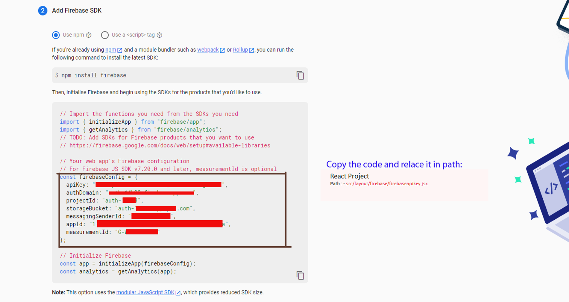
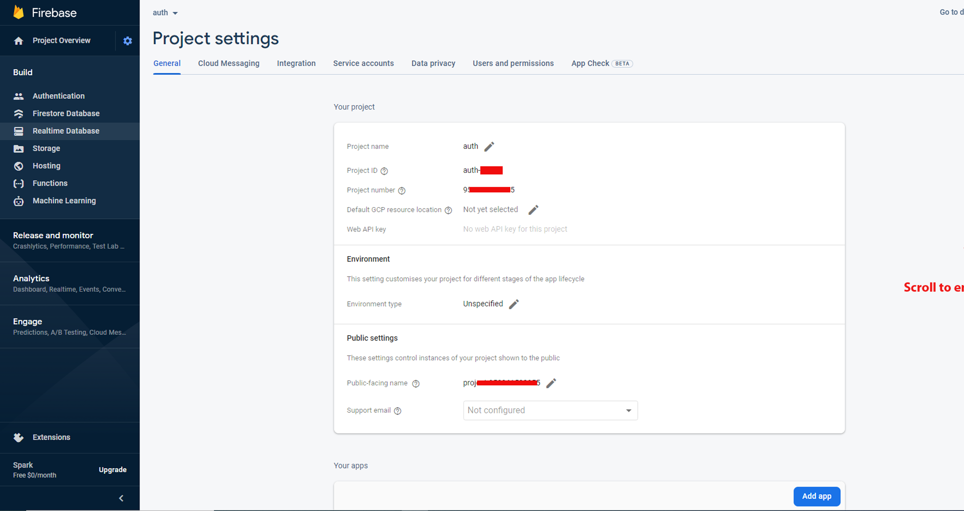
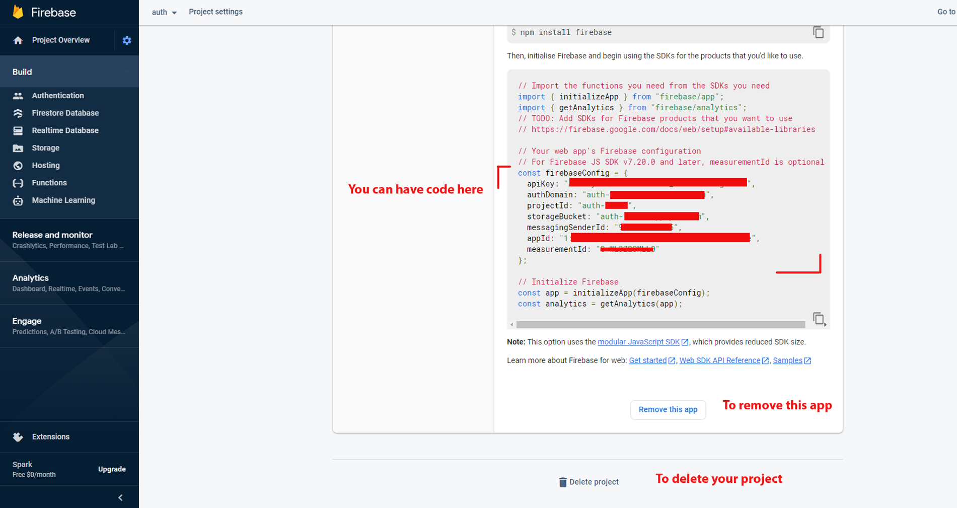
step-2: Add firebase API configuration details(create database on firebase) to the firebase Auth Component refer the path (/shared/firebase/firebaseapi.tsx)
next
Firebase Revocation process
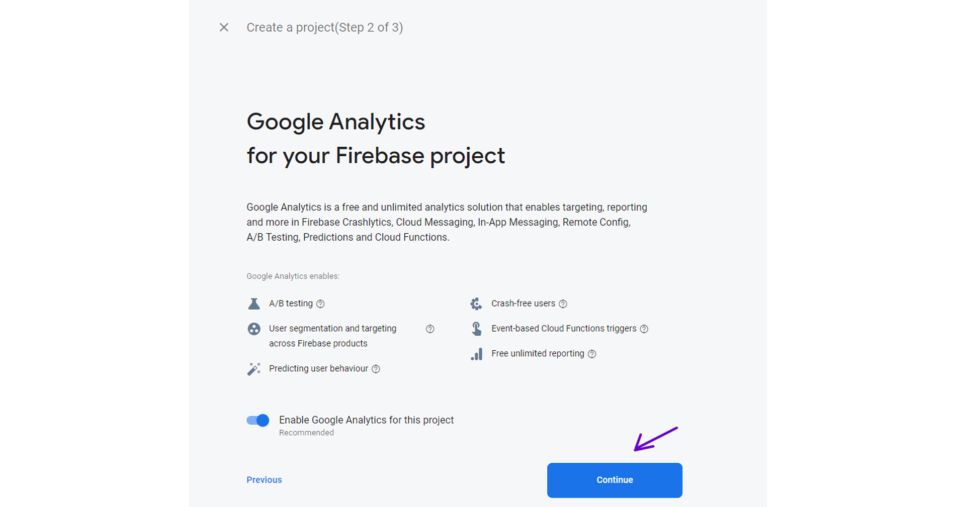
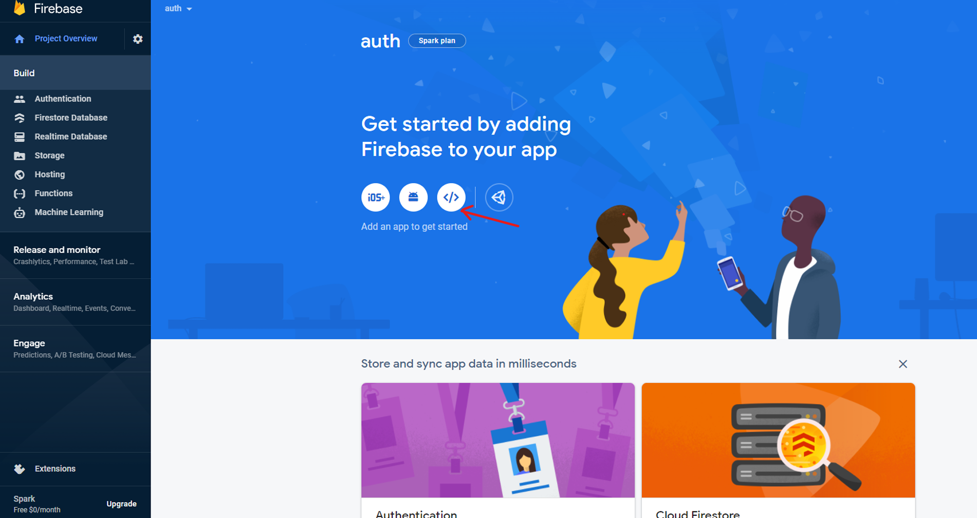
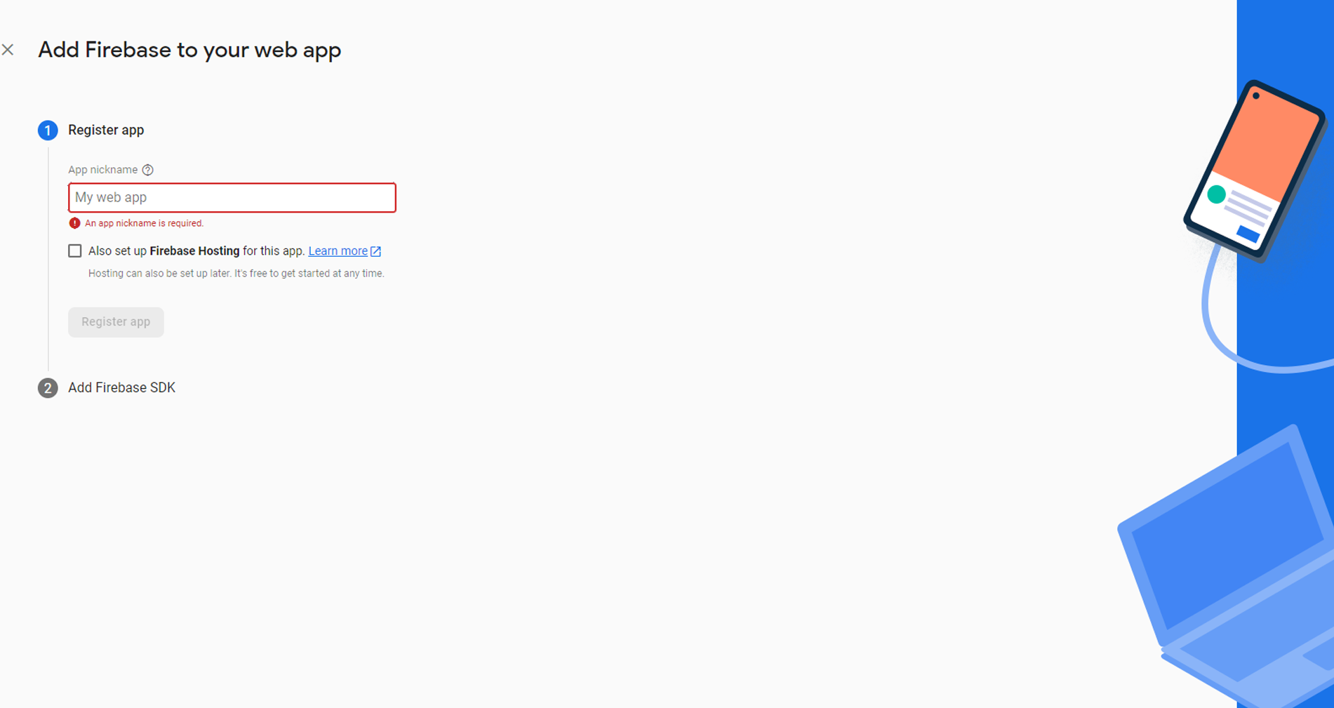
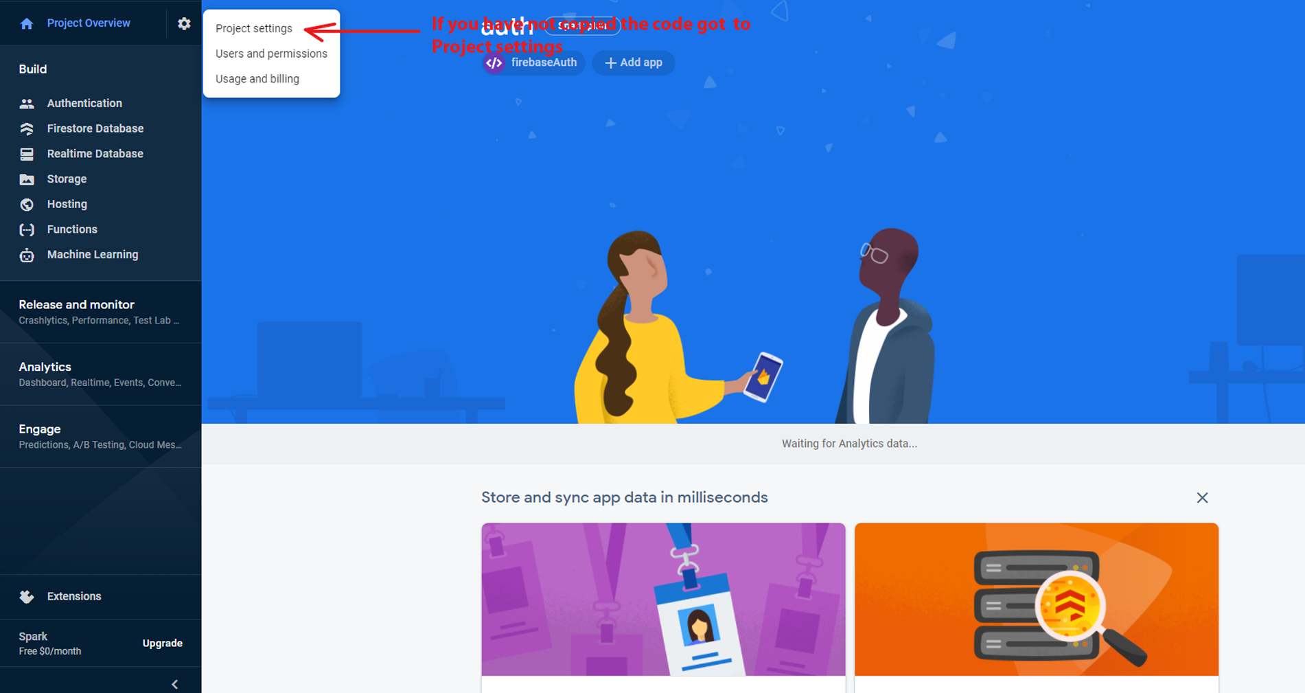
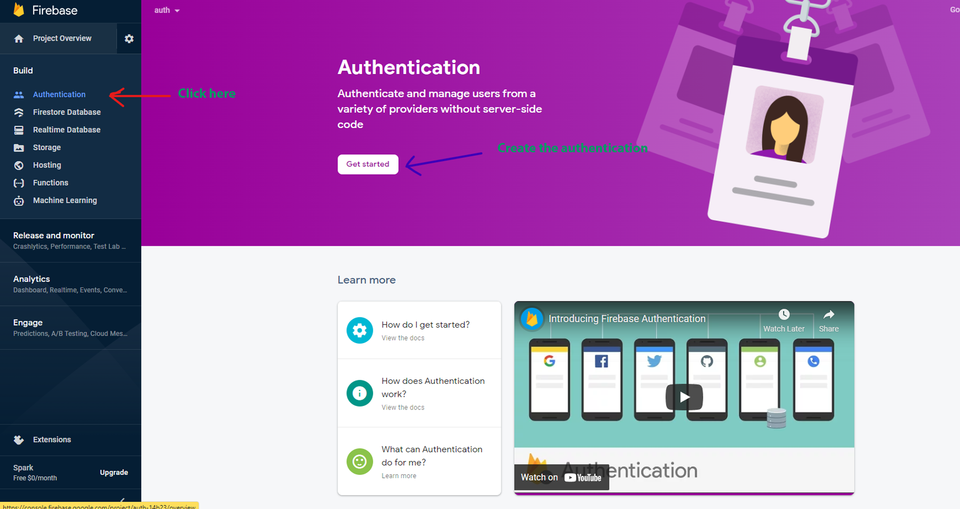
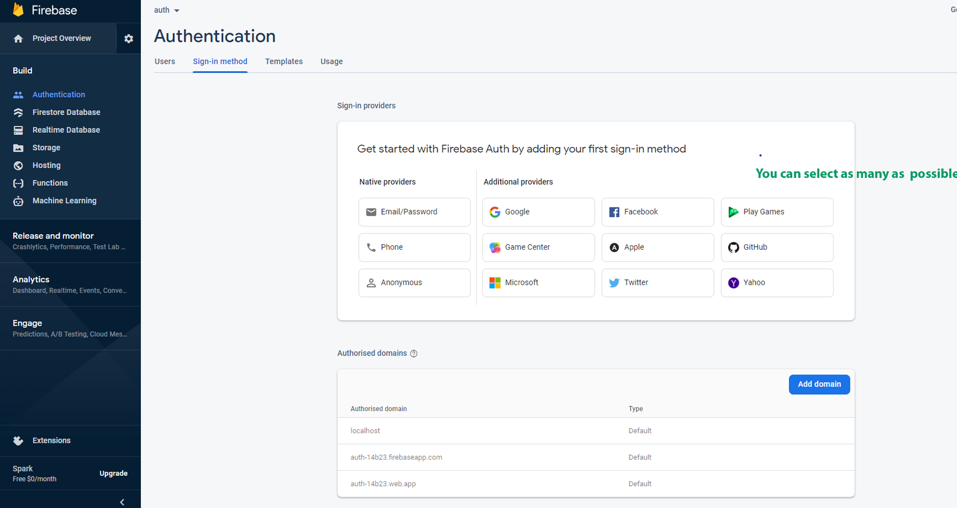
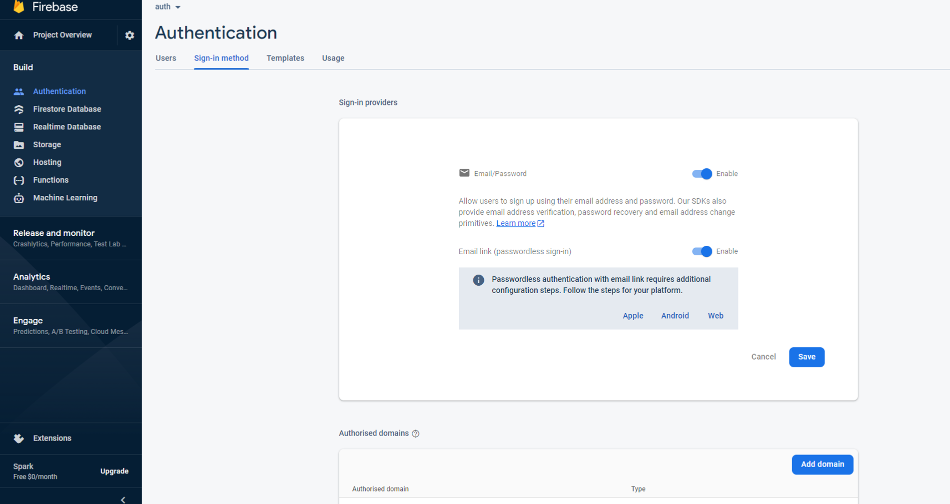
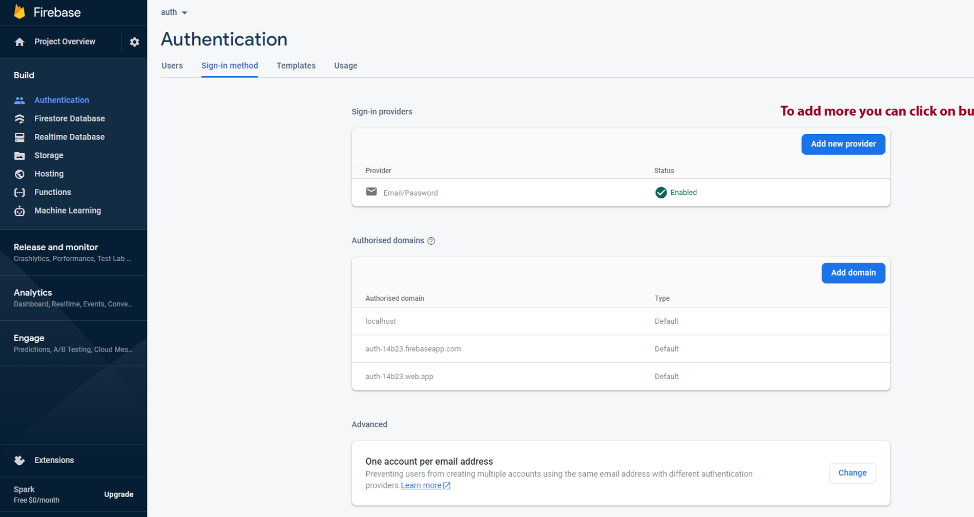
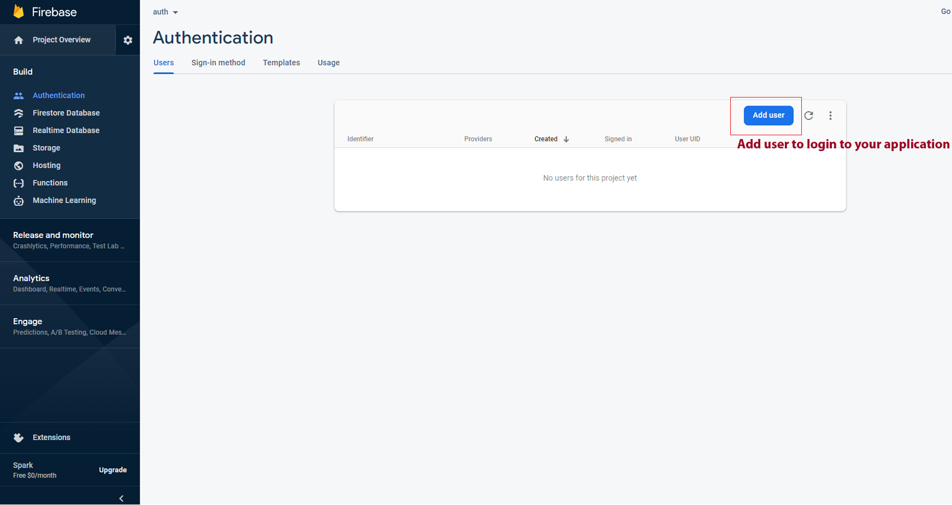
To remove firebase from the project make sure that you have to remove the firebase tab from the (app\page.tsx). change the key variable to 'next.js' Example : const [key, setKey] = useState('next.js') in the the (app\page.tsx).Firebase installation process
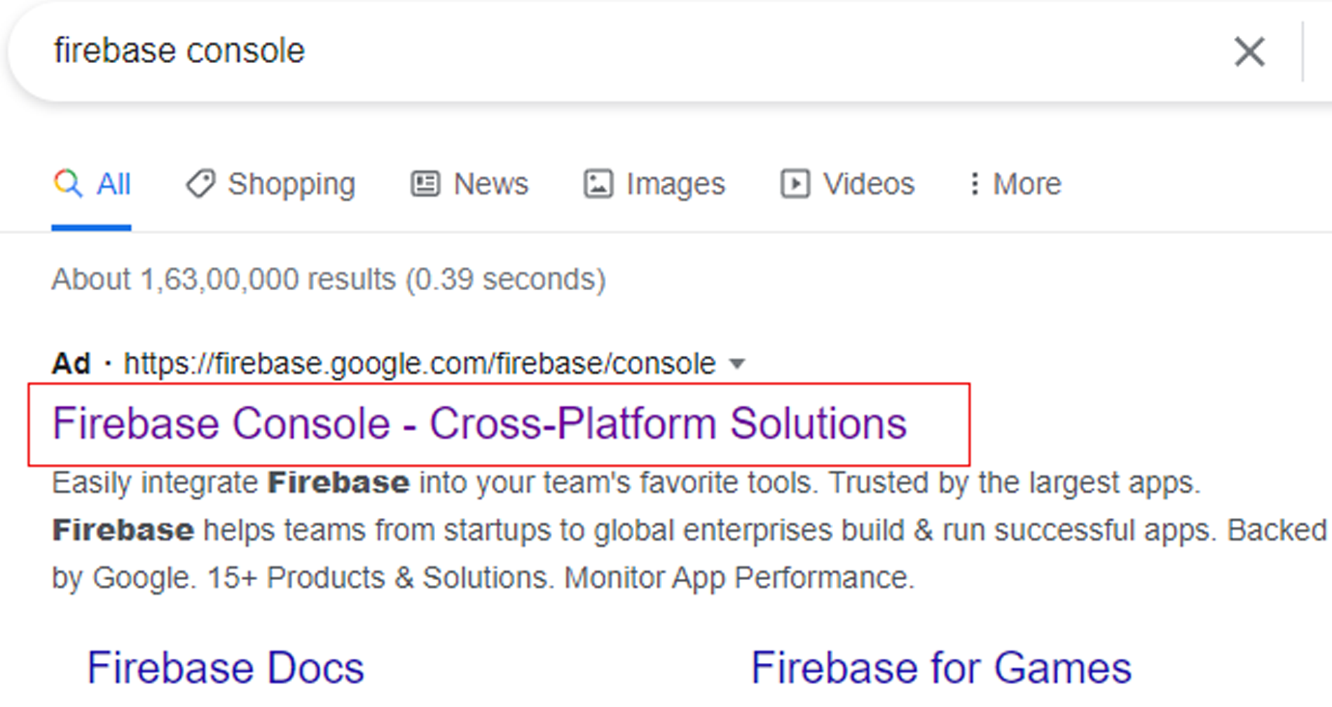
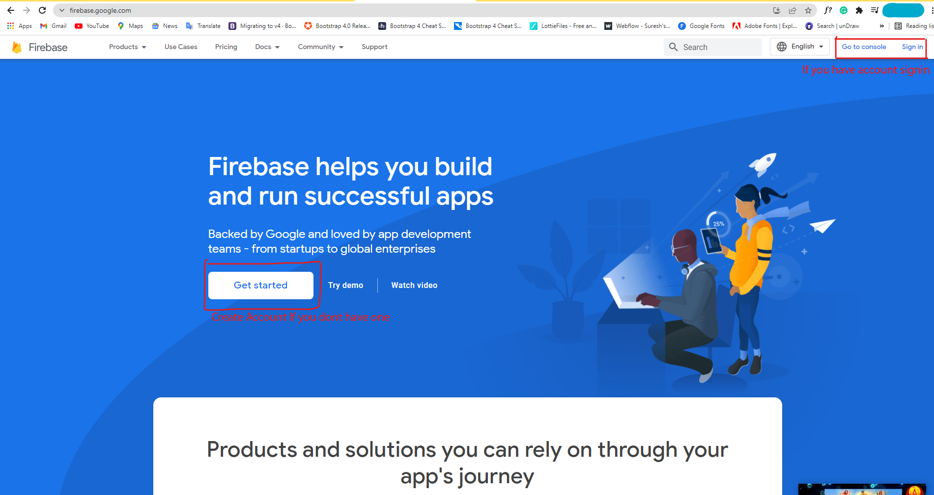
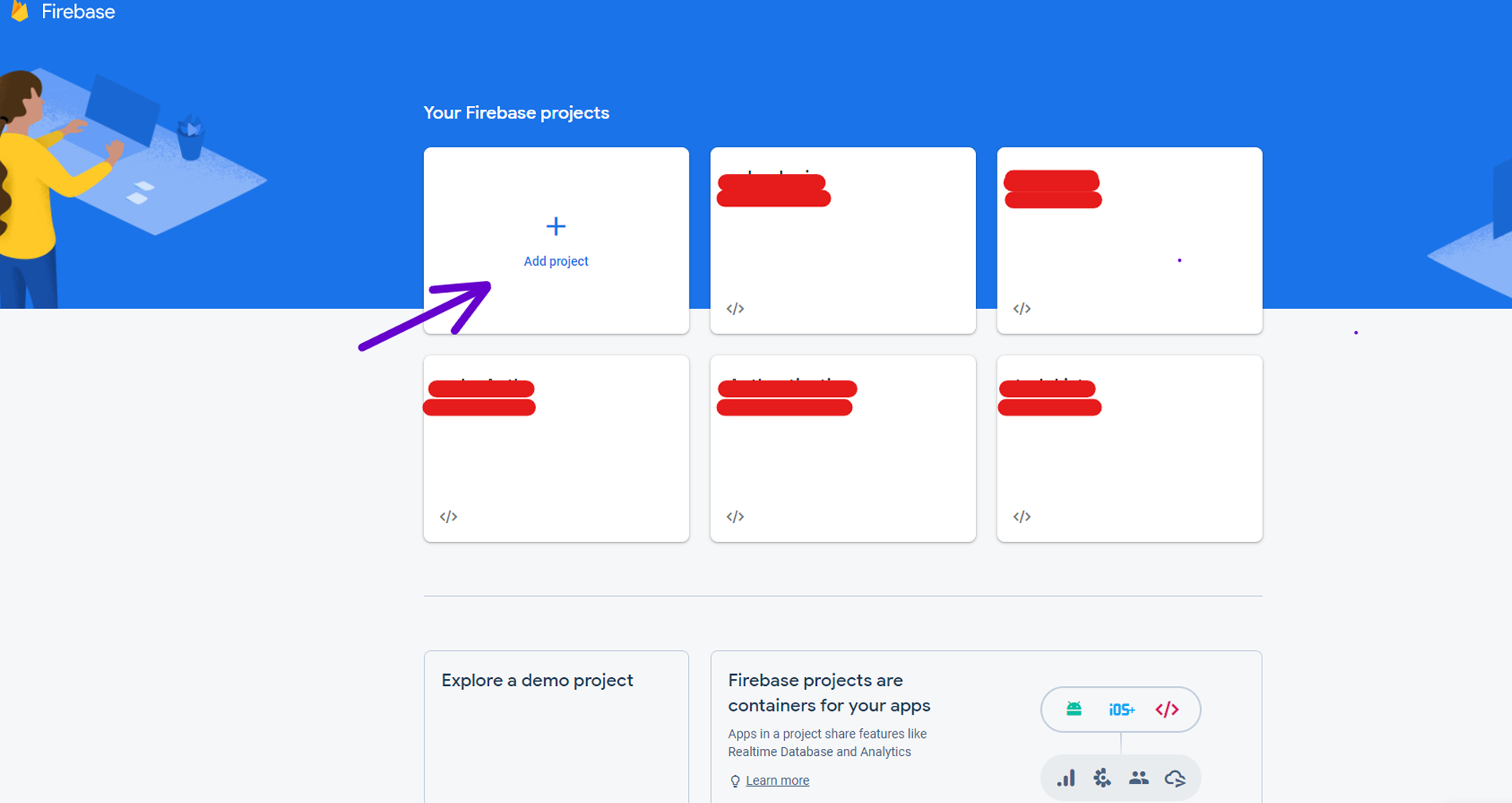
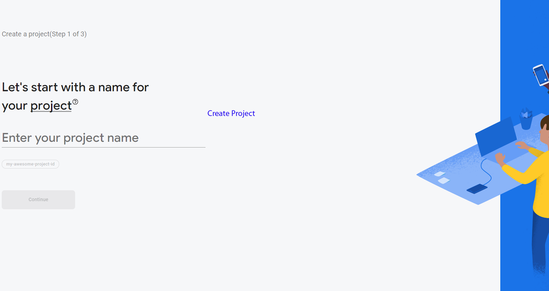


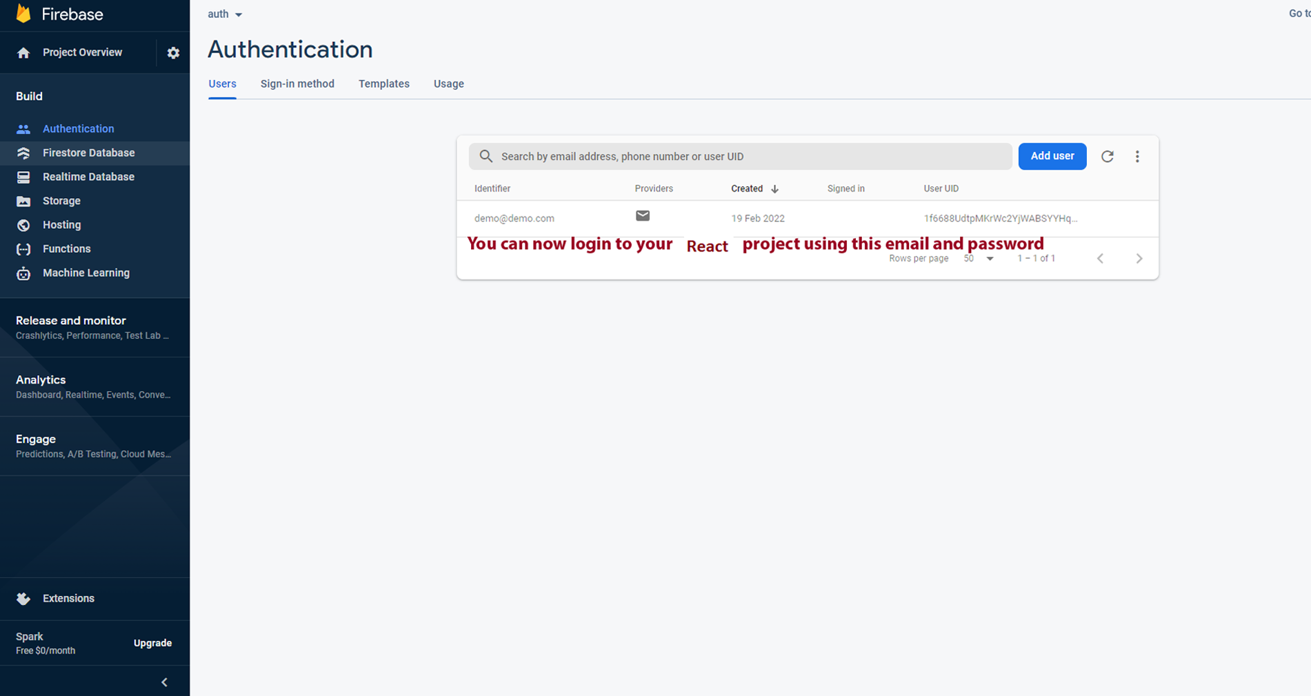
FAQ'S
Step 1:
Go To style.scss (public/assets/scss/styles.scss )
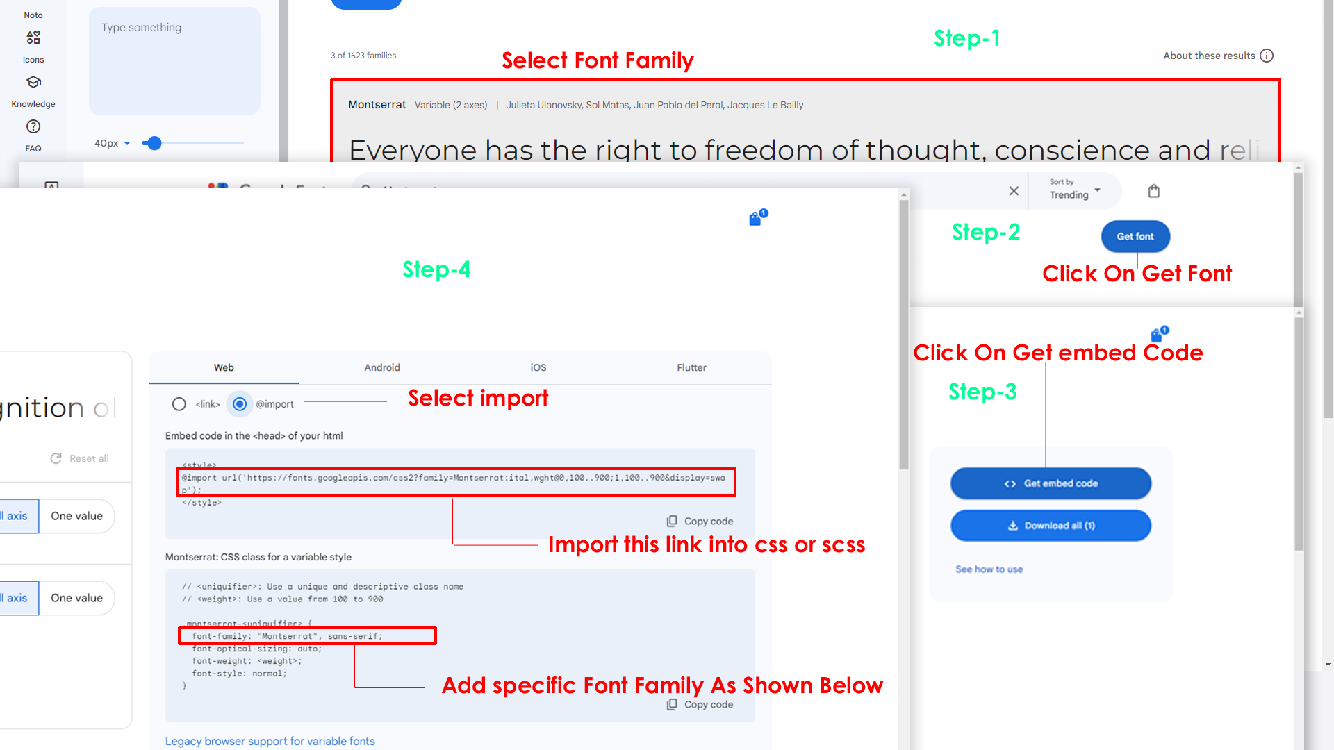
if you want to change another font-family Go to the site Google Fonts And Select One font Family and import in to styles.scss file
How to Select font Family
Step 2:
And paste Your Selected font-family in style.scss

Step 3:
And add the Your Selected font-family in _variables.scss(public/assets/scss/_variables.scss)
code
--default-font-family: "Space Grotesk", sans-serif;By default menu icons are in the from remix icon if you want to change the icons please follow below steps
Step 1 :
To change Menu icons, open sidebar.tsx page
Path: shared\layouts-components\sidebar\sidebar.tsx
and go through app-sidebar section, in that section
you will find
icon tag, there you can replace previous icon
with your icon. Example as shown in below
next
Go To
"public/assets/images/brand-logos"
folder and replace
your
logo with Previous Logos within in image size.
note: Please don't increase logo sizes. Replace your logo within
given
image size. otherwise the logo will not fit in particular place
it
disturbs the template design.
Step1:
To clear LocalStorage loading functions you need to remove
LocalStorageBackup() function in
custom-switcher.min.js
shared\data\switcherdata\switcherdata.tsx as
shown
below
javascript
export const LocalStorageBackup {}Step2:
To remove complete LocalStorage saving you need to
remove
all localstorage related calling functions like
LocalStorageBackup in
layout.tsx
app/(components)layout.tsxfile.Below are
the some examples to find out.
javascript
   useEffect(() => {
   if (typeof window !== 'undefined' && !theme.pageloading) {
       LocalStorageBackup(theme.setpageloading);
   }
}, []);Step1:
Open header.tsx component
shared\layouts-components\header\header.tsx
To remove switcher section as shown below.
<li className="header-element">
<Link scroll={false} href="#!" className="header-link switcher-icon" data-bs-toggle="offcanvas" data-bs-target="#switcher-canvas" onClick={handleShow} >
    <svg xmlns="http://www.w3.org/2000/svg" className="header-link-icon" viewBox="0 0 256 256">
    <rect width="256" height="256" fill="none" />
    <path d="M207.86,123.18l16.78-21a99.14,99.14,0,0,0-10.07-24.29l-26.7-3a81,81,0,0,0-6.81-6.81l-3-26.71a99.43,99.43,0,0,0-24.3-10l-21,16.77a81.59,81.59,0,0,0-9.64,0l-21-16.78A99.14,99.14,0,0,0,77.91,41.43l-3,26.7a81,81,0,0,0-6.81,6.81l-26.71,3a99.43,99.43,0,0,0-10,24.3l16.77,21a81.59,81.59,0,0,0,0,9.64l-16.78,21a99.14,99.14,0,0,0,10.07,24.29l26.7,3a81,81,0,0,0,6.81,6.81l3,26.71a99.43,99.43,0,0,0,24.3,10l21-16.77a81.59,81.59,0,0,0,9.64,0l21,16.78a99.14,99.14,0,0,0,24.29-10.07l3-26.7a81,81,0,0,0,6.81-6.81l26.71-3a99.43,99.43,0,0,0,10-24.3l-16.77-21A81.59,81.59,0,0,0,207.86,123.18ZM128,168a40,40,0,1,1,40-40A40,40,0,0,1,128,168Z" opacity="0.2" />
    <circle cx="128" cy="128" r="40" fill="none" stroke="currentColor" strokeLinecap="round" strokeLinejoin="round" strokeWidth="16" />
    <path d="M41.43,178.09A99.14,99.14,0,0,1,31.36,153.8l16.78-21a81.59,81.59,0,0,1,0-9.64l-16.77-21a99.43,99.43,0,0,1,10.05-24.3l26.71-3a81,81,0,0,1,6.81-6.81l3-26.7A99.14,99.14,0,0,1,102.2,31.36l21,16.78a81.59,81.59,0,0,1,9.64,0l21-16.77a99.43,99.43,0,0,1,24.3,10.05l3,26.71a81,81,0,0,1,6.81,6.81l26.7,3a99.14,99.14,0,0,1,10.07,24.29l-16.78,21a81.59,81.59,0,0,1,0,9.64l16.77,21a99.43,99.43,0,0,1-10,24.3l-26.71,3a81,81,0,0,1-6.81,6.81l-3,26.7a99.14,99.14,0,0,1-24.29,10.07l-21-16.78a81.59,81.59,0,0,1-9.64,0l-21,16.77a99.43,99.43,0,0,1-24.3-10l-3-26.71a81,81,0,0,1-6.81-6.81Z" fill="none" stroke="currentColor" strokeLinecap="round" strokeLinejoin="round" strokeWidth="16" />
</svg>
    </Link>
    <Switcher show={show} handleClose={handleClose} />
</li>
Step2:
Remove the switcher component from the
main layout follow the path
Path: app/(components)/(content-layout)/layout.tsx
    import Switcher from "@/shared/layouts-components/switcher/switcher"

    <Switcher />
Step3:
Now remove the switcher component and switcherData file
from the root folder, follow the path
Switcher component shared/layouts-components/switcher/switcher.tsx
and
switcherdata file from /shared/data/switcherdata/switcherdata.tsx
Step1:
Open layout.tsx component
/apps/components/authentication-layout/layout.tsx
To remove switcher section as shown below.
import LandingSwitcher from '@/shared/layouts-components/switcher/landing-switcher';

    <LandingSwitcher/>
Step2:
Remove the LandingSwitcher component from
the
main layout follow the path
\app\(components)\(landing-layout)\layout.tsx
            import Landingswitcher from '@/shared/layouts-components/switcher/landing-switcher'

            <Landingswitcher />
Step3:
Now remove the landingswitcher component from the root
folder, follow the path
\shared\layouts-components\switcher\landing-switcher.tsx
and
Please follow the below steps to change Primary Color
Step 1 :
To change Primary Color you have to open _variables.scss file and replace what color you want as shown in below
Rootpath : _variables.scss (public/assets/scss/_variables.scss )

Please follow the below steps to change Dark body Color
Step 1 :
Make sure the theme is set completely to dark mode by adding the following attributes to the html tag data-theme-mode="dark" data-header-styles="dark" data-menu-styles="dark"
Step 2 :
To change Dark body Color you have to open _variables.scss file and replace what color you want as shown in below
Rootpath : _variables.scss (public/assets/scss/_variables.scss )
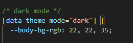
Step 3 :
Also Change the following variable colors to the desired theme background accordingly in [data-theme-mode="dark"]
--light-rgb : --form-control-bg : --input-border : --gray-3 :Credit's
Icons Credit
| Icons | References |
|---|---|
| Bootstrap Icons | https://icons.getbootstrap.com/ |
| Boxicons | https://boxicons.com/ |
| Remix Icons | https://remixicon.com/ |
| Feather Icons | https://feathericons.com/ |
| Tabler Icons | https://tabler-icons.io/ |
| Line Awesome Icons | https://icons8.com/line-awesome |
| Phosphor Icons | https://phosphoricons.com/ |
Images Credit
| Images | References |
|---|---|
| Vecteezy | https://www.vecteezy.com/ |
| Iconscount | https://iconscout.com/ |
| Unsplash | https://unsplash.com/ |
| Png Tree | https://pngtree.com/ |
| flaticon | https://www.flaticon.com/authors/flat-icons |
| freepik | https://www.freepik.com |
Fonts Credit
| Font | References |
|---|---|
| Google Fonts | https://fonts.google.com/ |
Sidemenu Icons
| Icon | References |
|---|---|
| phosphor Icons | https://phosphoricons.com/ |
Switcher styles
(Root:apps/(components)/layout.tsx)
html
<html lang="en" dir="ltr" data-nav-layout="vertical" data-theme-mode="light" data-header-styles="transparent" data-width="fullwidth" data-menu-styles="transparent" data-page-style="flat" data-toggled="close" data-vertical-style="doublemenu" data-toggled="double-menu-open">html
data-theme-mode="light" data-header-styles="light" data-menu-styles="light"html
data-theme-mode="dark" data-header-styles="dark" data-menu-styles="dark"html
dir="ltr"html
dir="rtl"html
data-nav-layout="vertical"html
data-nav-layout="horizontal" data-nav-style="menu-click"html
data-page-style="regular"html
data-page-style="classic"html
data-page-style="modern"html
data-page-style="flat"html
data-width="default"html
data-width="full-width"html
data-width="boxed"html
data-header-position="fixed"html
data-header-position="scrollable"html
data-vertical-style="closed"html
data-vertical-style="icontext"html
data-vertical-style="overlay"html
data-vertical-style="detached"html
data-vertical-style="doublemenu"html
loader="enable"html
loader="disable"html
data-menu-styles="light"html
data-menu-styles="dark"html
data-menu-styles="color"html
data-menu-styles="gradient"html
data-menu-styles="transparent"html
data-header-styles="light"html
data-header-styles="dark"html
data-header-styles="color"html
data-header-styles="gradient"html
data-header-styles="transparent"html
data-bg-img="bgimg1"html
data-bg-img="bgimg2"html
data-bg-img="bgimg3"html
data-bg-img="bgimg4"html
data-bg-img="bgimg5"Swiper JS :
React Swiper is a modern, feature-packed carousel component for React, offering smooth transitions, touch support, and advanced features like autoplay and lazy loading. It’s a flexible, performance-driven alternative to traditional carousels like Bootstrap.
nextjs
Nextjs
css
nextjs
Plugin Link
https://swiperjs.com/reactReference Link
https://www.npmjs.com/package/swiperReact-Apexcharts :
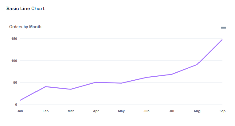
React-ApexCharts is a React wrapper for the popular ApexCharts library, enabling the easy creation of interactive, responsive charts. It offers a wide range of chart types and customization options with seamless React integration.
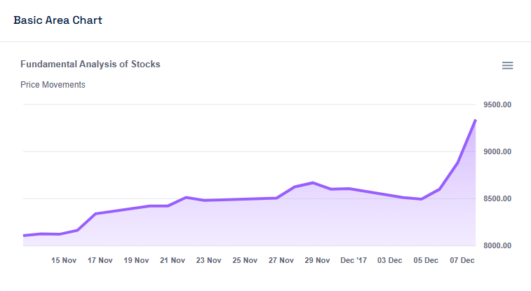
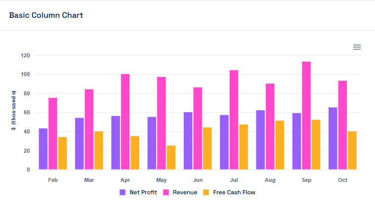
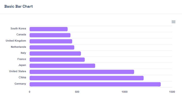
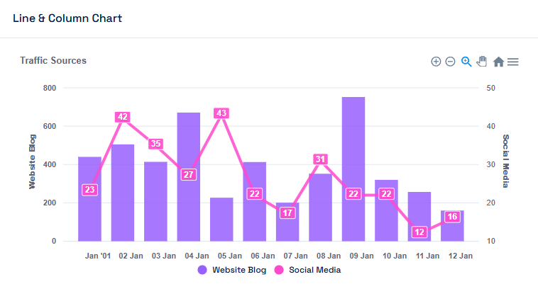
nextjs
Nextjs
nextjs
Plugin Link
https://www.npmjs.com/package/apexchartsReference Link
https://apexcharts.com/react-chart-demos/React Suneditor :
React SunEditor is a lightweight, customizable editor for React, providing rich text editingfeatures. It supports various formats, plugins, and is highly extensible for smooth integration into React applications.
nextjs
Nextjs
css
nextjs
Plugin Link
https://www.npmjs.com/package/suneditor-reactReference Link
https://www.npmjs.com/package/suneditor-reactReact DatePicker :
React Datepicker is a React wrapper for the Datepicker date picker library, offering a lightweight and customizable solution for selecting dates and times. It provides smooth integration, supports various date formats, and includes features like range selection, time picking, and more.
nextjs
Nextjs
css
Plugin Link
https://www.npmjs.com/package/react-datepickerReference Link
https://reactdatepicker.com/React Select :
React Select is a flexible, customizable dropdown/select input component for React, offering features like multi-select, search, and async options. It provides an intuitive, user-friendly interface with advanced styling and accessibility support.
nextjs
Nextjs
nextjs
Plugin Link
https://www.npmjs.com/package/react-selectReference Link
https://www.npmjs.com/package/suneditor-reactReact GridJs :
React Grid.js is a React wrapper for the Grid.js table library, enabling the creation of interactive, customizable, and responsive data tables. It supports features like sorting, filtering, pagination, and inline editing, with a focus on performance and easy integration into React projects.
nextjs
Nextjs
nextjs
css
Plugin Link
https://www.npmjs.com/package/gridjs-reactReference Link
https://gridjs.io/docs/examples/hello-worldReact Toastify :
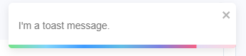
React Toastify is a lightweight and easy-to-use notification library for React that allows you to display customizable, non-blocking toast messages. It supports various notification types, automatic dismissal, and seamless integration, enhancing the user experience with minimal setup.
nextjs
Nextjs
Plugin Link
https://www.npmjs.com/package/react-toastifyReference Link
https://fkhadra.github.io/react-toastify/introduction/React Ratings(MUI) :
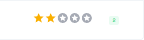
React Material-UI Ratings is a component that integrates Material-UI's design system to create customizable, interactive rating systems in React applications. It allows users to easily select a rating through stars or other symbols, with built-in support for customization, accessibility, and styling.
nextjs
Nextjs
Plugin Link
https://www.npmjs.com/package/@mui/materialReference Link
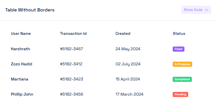
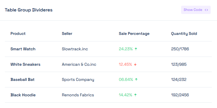
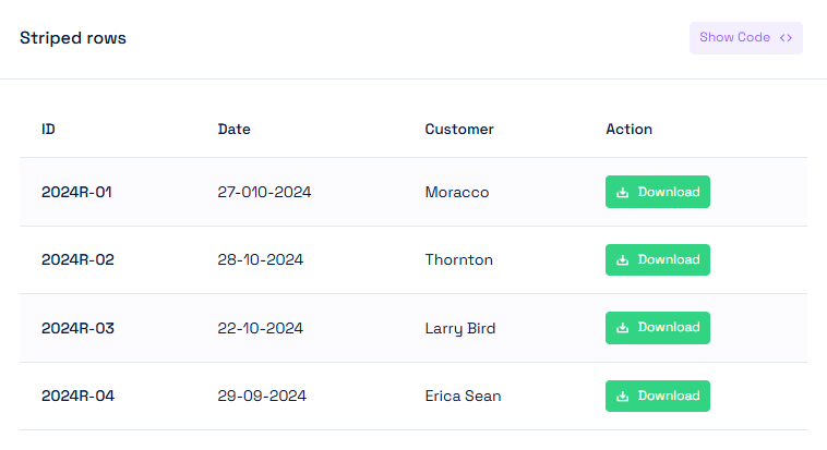
https://mui.com/material-ui/react-rating/Basic Table : :
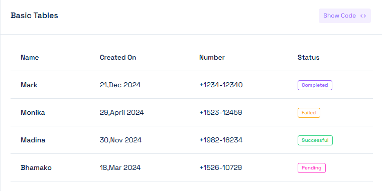
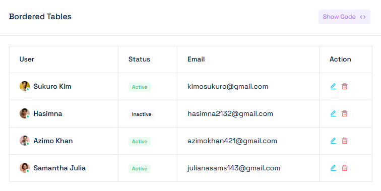
React Basic tables are simple, customizable table components for displaying structured data in a clean and responsive layout
nextjs
data
Alerts :
React Bootstrap Alerts are pre-styled, customizable alert components that integrate Bootstrap's alert system with React. They provide an easy way to display important messages or notifications, with built-in support for different styles (success, error, info, etc.), dismissible functionality, and seamless React integration.
nextjs
data
Buttons :
React Bootstrap Buttons are pre-styled, responsive button components that follow React Bootstrap’s design system, offering various styles, sizes, and colors. They provide an easy-to-use and customizable solution for creating interactive buttons in React applications, with support for icons, loading states, and more.

nextjs
data
Badges :
React Bootstrap Badges are small, customizable components used to display labels, notifications, or counters within your React application. They integrate seamlessly with React Bootstrap’s design system and support various styles, colors, and positions, making them ideal for highlighting important information or adding context to UI elements like buttons, links, or navigation items.

nextjs
data
Button Group :
React Bootstrap Button Group is a component that allows you to group multiple buttons together, providing a clean, unified look and facilitating interactions like toggling or switching between options. It integrates seamlessly with React Bootstrap's button styles and offers customization options for size, alignment, and behavior within React applications.

nextjs
Cards :
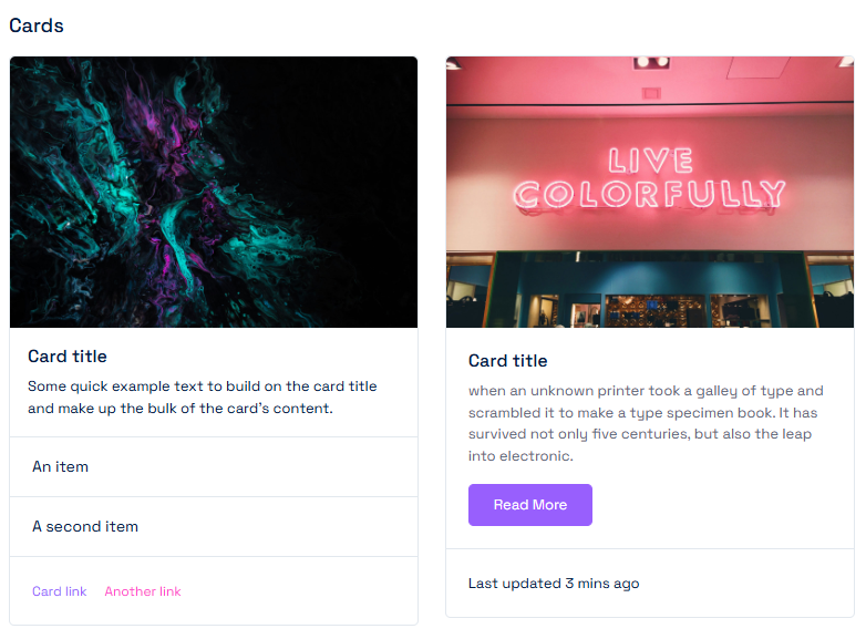
React Bootstrap Cards are versatile, customizable components for displaying content in a flexible, structured layout. They integrate Bootstrap’s card system with React, allowing you to create various types of content containers with options for images, headers, footers, and more, making them ideal for building rich, responsive UI elements.
nextjs
Breadcrumb :
React Bootstrap Breadcrumb is a navigation component that displays a series of links to help users understand their location within a hierarchical structure. It seamlessly integrates with React Bootstrap’s breadcrumb styling, offering customizable options for separators, active links, and responsive behavior in React applications.

nextjs
Dropdown :
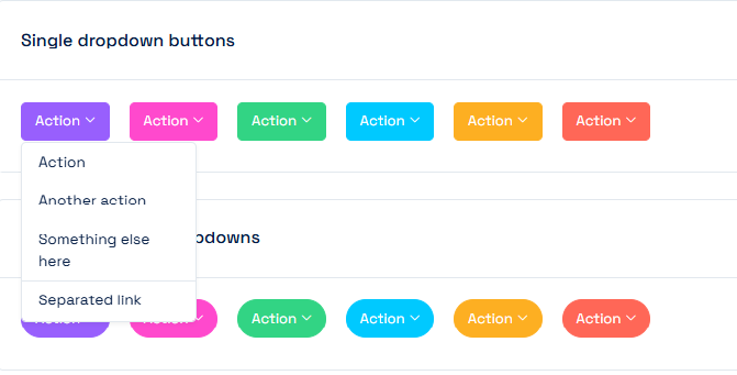
React Bootstrap Dropdown is a component that provides a simple way to create dropdown menus in React applications, following React Bootstrap's design conventions. It supports various options like single or multi-level menus, alignment, and customization of triggers (e.g., buttons or links), making it easy to build responsive, interactive dropdowns with minimal effort.
nextjs
nextjs
Tooltips :
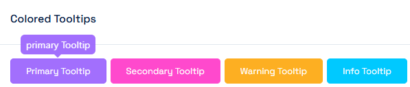
React Bootstrap Tooltips are small, customizable pop-up elements that provide additional information when users hover over or focus on an element. Built on React Bootstrap’s tooltip system, they offer easy integration in React applications, supporting various customization options like positioning, trigger events, and animations for a better user experience
nextjs
nextjs
Popovers :
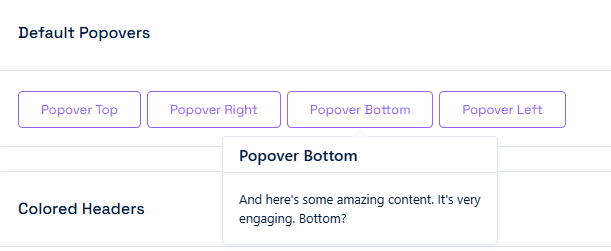
React Bootstrap Popovers are interactive components that display additional content or information when users click or hover over an element. Built on React Bootstrap’s popover system, they offer easy integration in React applications, with support for customizable content, placement, and triggers, allowing you to enhance the user interface with rich, contextual overlays.
nextjs
nextjs
Progress :
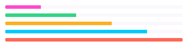
React Bootstrap Progress is a component that allows you to display progress bars in React applications, indicating the completion status of tasks or operations. It integrates seamlessly with React Bootstrap’s progress bar styles, supporting features like custom labels, striped animations, and varying bar colors for easy customization and responsiveness.
nextjs
nextjs
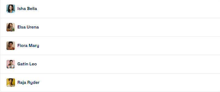
List Group :
React Bootstrap ListGroup is a component for creating lists of items with consistent styling and behavior, using Bootstrap's list group system. It supports features like custom item content, active states, badges, and links, making it easy to build interactive and organized lists in React applications with full customization options.
nextjs
nextjs
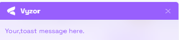
Toast :
React Bootstrap Toast is a component for displaying lightweight, non-blocking notifications or messages in React applications. It integrates with React Bootstrap’s toast system, offering features like auto-dismiss, customizable timing, and different styling options for success, error, or info messages, making it easy to provide feedback to users in a clean and responsive way.
nextjs
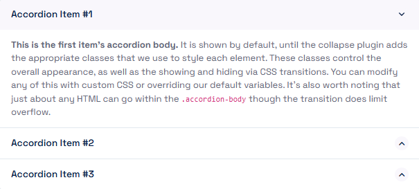
Accordions :
React Bootstrap Accordion is a component that allows you to display collapsible content panels in a stack, ideal for organizing large amounts of content in a compact, interactive layout. It integrates with React Bootstrap’s accordion system, supporting features like multiple or single panel expansion, custom styling, and smooth animations, making it easy to create dynamic, space-efficient UIs in React applications.
nextjs
nextjs
Carousel :
React Bootstrap Carousel is a component for creating responsive, interactive image sliders or carousels in React applications. It integrates seamlessly with React Bootstrap’s carousel system, offering features like slide transitions, controls, indicators, and automatic cycling, allowing you to display a series of content in an engaging and user-friendly way.
nextjs
nextjs
React-leaflet Maps :
Leaflet Maps is a modern javascript maps plugin..
Installing and usage
nextjs
nextjs
css
Plugin link
https://react-leaflet.js.org/Reference Link
https://www.npmjs.com/package/react-leafletPigeon Maps :
Pigeon Maps is a modern javascript maps plugin..
Installing and usage
nextjs
nextjs
Plugin link
https://pigeon-maps.js.org/Reference Link
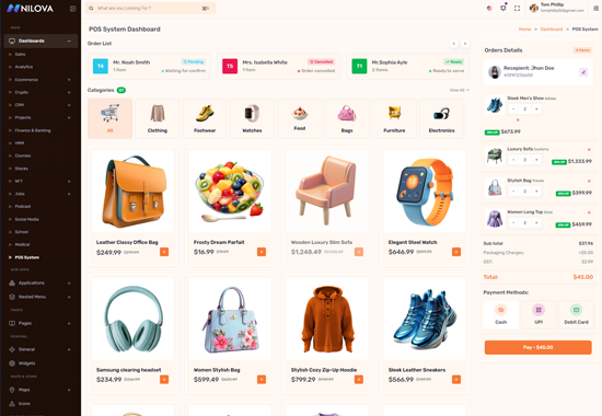
https://www.npmjs.com/package/pigeon-mapsAdditional Plugins Included :
The following plugins have also been included, apart from the ones already listed in the above sections

Information
-
Updated Date06/June/2026
-
Author
-
Company's Website
-
Company's Portfolio
-
Created Date12/Apr/2026